

Hullo, bookdragons!
MY BOOKSTAGRAM IS TURNING TWO YEARS OLD IN AUGUST 7! I wrote this post in celebration of that and I also figured that it would be more fun if I got to share some useful tips to everyone for my second bookstagram anniversary.
When I was still considering to make a bookstagram account, I was hesitant because a) I didn’t have a good enough camera to take photos with, b) I didn’t have enough props, and c) I didn’t have enough books. As usual, I was just overthinking because I DID have enough of these things. I was just intimidated that most people had MORE than what I did.* In the end, I found that using my phone to take pictures and improvising with my props worked out just fine. Most of all, editing my pictures solved my problem of not having too many books.
*If you want tips on how to make your bookstagram work, read this old blog post of mine. My pictures have changed a lot since then but it’s still useful if you need some bookstagram tips and tricks to get yourself started.
In this post, I’m walking you through the step-by-step process on how I edit book covers into my bookstagram pictures. If you’re like me who doesn’t have a lot of physical books, editing your pictures can really work wonders. I use Adobe Photoshop CS6 for editing. I know that this application is not the most accessible so I’m linking a couple tutorials down below which use different applications for their editing process (tbh theirs are better because the apps they use are free so PLEASE PLEASE check them out if you don’t have Photoshop).
- Cait @ PaperFury uses Pixlr to edit in book covers into her bookstagram pictures.
- Xandra @ Starry Sky Books uses Adobe Photoshop Mix (it’s a free mobile app!) and she even posted an additional tutorial where she used Pixlr E for editing.
Again, I acknowledge that I am privileged enough to have a full version of Photoshop CS6 (it’s an old version but it’s still handy and the functions are relatively the same to the new ones) so if you don’t have one please visit the tutorials I linked above. However, if you do have Adobe Photoshop and you want to learn how to edit in book covers using that application, then this post is for you. Just a little disclaimer that I am not a Photoshop expert and that most of my experience is based on dumb luck, sheer determination, and pixie dust. Despite this, I am proud of the photos I have edited so far and they’re nice to look at so maybe I am doing something remotely right here.
Before I dig a bigger hole for myself, let’s get started.
1. Get your picture ready.
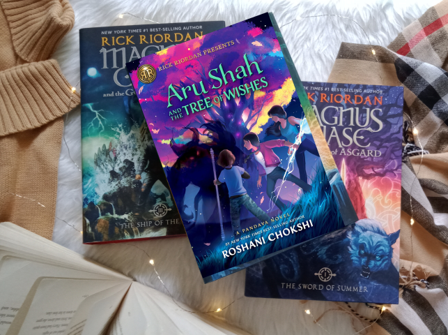
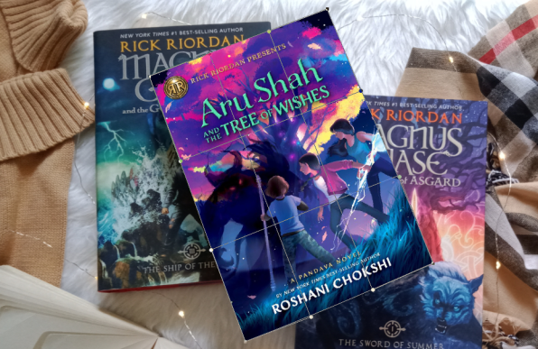
Take your picture (forgive me for these obvious instructions). It’s best if you use books that have the same colors as the ones you want to edit in. The goal in my case is to replace the Magnus Chase covers with Rick Riordan Presents book covers. These books don’t have the exact same colors but I chose the Magnus Chase books because they just felt right (okay fine I already suck at this tutorial thing ajdjs). You should also consider the arrangement of the props you’re using. In this case, I chose a picture that doesn’t have fairy lights tangled into the books themselves because IT’S A PAIN TO ERASE FAIRY LIGHTS WIRE WHEN EDITING (they’re smol details and my patience is also smol).

2. Import your photos to Adobe Photoshop.
Open the app and drag your chosen photo to your workspace. Once that is done, drag the first book cover you want to edit into your original photo. Use high resolution book covers for best results. I always get high res covers from edelweiss so I suggest that you get them from there (goodreads covers just don’t cut it 😌). Make your photo larger, preferably while holding the Shift button so as not to destroy the photo’s proportions. Rotate the photo and lay it down above the original cover you want to replace.
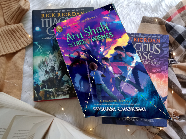
3. Distort.
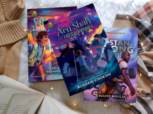
Now, as you can see above, the Aru Shah cover still needs a lot of adjusting to fit into the remaining spaces. That’s where Transform becomes handy. Choose the Aru Shah layer and use Ctrl + T (note that this is a Windows command because I don’t own a Mac). You can also go to Edit –> Transform and choose Distort from the drop-down. Distort makes your photo go whoa and it makes it easier to adjust the corners of your picture to fit into the original cover. Press Enter if you think it fits nicely already.

4. Warp.
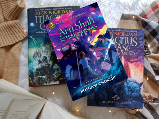
Sometimes Distort is not enough. Looking closely, there are still spaces at the edges that aren’t completely filled out yet. That’s where Warp comes in. Go to Edit –> Transform once again and choose Warp from the drop-down. I have discovered that Warp is the best option to use when filling small remaining spaces because it has more control points that you can use to adjust your photo.
5. Use image adjustments.
It’s important to adjust the brightness, contrast, and saturation of your inserted book cover so that it will look more authentic and less sharp. To do this, choose the layer of your book cover, right click, and rasterize your layer. This is important because you won’t be able to edit your image if you fail to rasterize it. Go to Image –> Adjustments and choose Brightness/Contrast. It’s now up to you to adjust the brightness and the contrast. In my case, I just lower both (tbh I don’t have a target number) and see if the photo looks good enough already. If it still doesn’t look authentic enough, I lower the saturation too.


6. Insert the other pictures.
If you’re only replacing one photo, then steps 1-5 are already enough. However, I wanted to replace all three covers so I also inserted two other covers and edited them in. I just used the same steps to do this.
7. Burn and Dodge
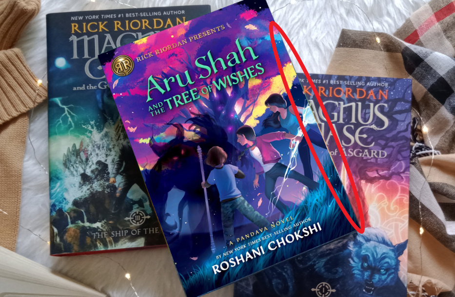
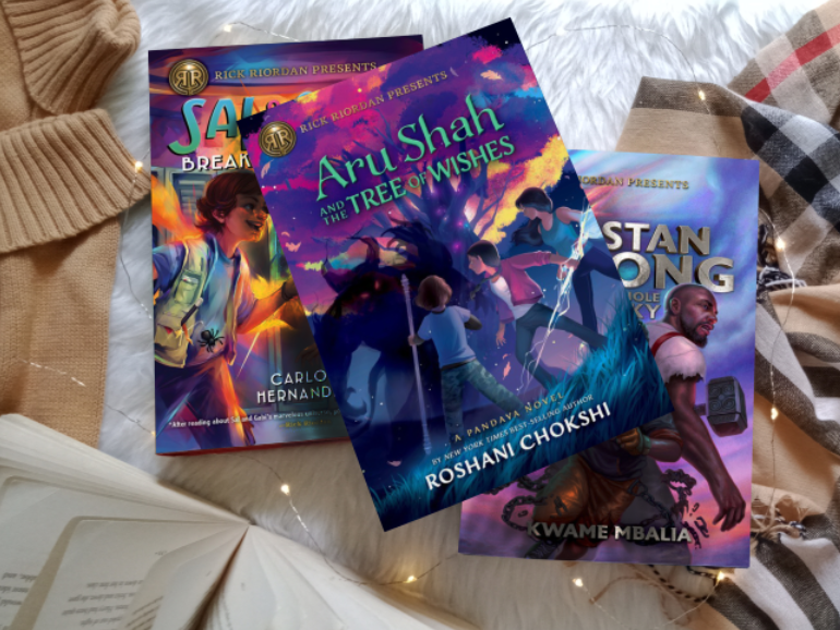
Now you may think “ooh the three covers have been replaced my work here is done!” but I’m sorry to say that you’re wrong and we still have some work to do. Look at the picture above. Yes, all three Magnus Chase covers have been replaced but it still looks quite incomplete, right? IT LOOKS TOO FLAT. It looks obviously edited because there are no shadows that give the covers extra dimension (I’m just pulling these terms out of my ass please look away). This is why we should use the burn and dodge tools (truth be told I just accidentally discovered them when I was looking at my too-flat and too-obviously-edited photo. Dumb luck works). The dodge tool lightens specific areas of an image. On the other hand, the burn tool darkens areas of an image. Obviously, we’re going to use the burn tool to darken certain areas of the picture and give it an illusion of shadows but you can use the dodge tool if you got carried away and darkened a portion of the image too much.
Just choose the Dodge tool from your panel and start darkening certain areas to make your picture look more authentic. You can refer to the original photo and see where the darker areas/shadows are and copy that. Make sure to choose the right layers when you’re doing this (e.g. choose the sal and gabi layer if you want to darken some parts of that cover).


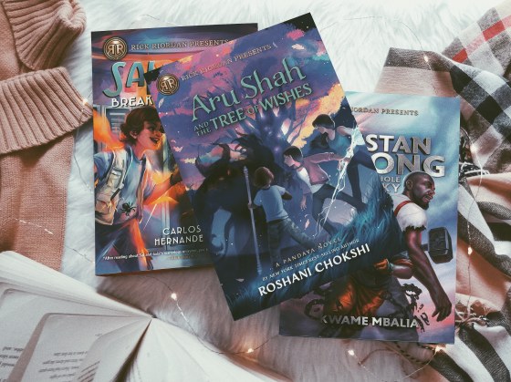
See the difference? Now the photo looks 100 times better!
8. Apply filters.
Now that you have successfully edited in your digital book covers, you can now save your final picture as a .jpeg or .png file. In my case, I do my additional edits on VSCO and I choose my final filter on Instagram (yes instagram filters do come in handy sometimes) and then you’re done! All you just have to do is think of a caption and post your picture to your loving followers (and then hope that the Instagram algorithm doesn’t eat you alive).
Here are some of the other pictures I edited:


Yep, in this Where Dreams Descend photo I really took the effort to include the fairy lights in the final edit. This means that I painfully erased the tiny fairy light wires to pull this off and it was a painful experience (I hope this makes sense).


I didn’t plan to edit this one but even though it was a spontaneous decision, I think it still turned out pretty well. I didn’t erase the fairy lights this time lmao.


I also use Adobe Photoshop to edit in photos over my phone (on my phone? I don’t know prepositions sorry not sorry). The process is pretty similar to what I discussed above. The only difference is that I use the blur tool to make the edges of the inserted covers softer.

And that’s it! I really hoped you learned something from this and that my instructions were easy enough to follow. I personally think that I suck at tutorials but I still wish you understood something from this post (pls say yes I’m desperate). I’m really sorry that I wasn’t able to feature a more accessible app but this is the only one that I know how to use for now.
If you like pretty pictures and pretty grids, PLEASE FOLLOW ME ON BOOKSTAGRAM (my handle is @bookdragonism). I’m still sad that my bookstagram growth declined when I went inactive as I started uni but now I’m (kind of) consistently posting again and I would love to get closer to 1.5k by tomorrow 👉🏽👈🏽

Thank you for the support! Let’s all hope that I will be able to post consistently on bookstagram in the upcoming months.

Do you have a bookstagram? What is your most favorite thing about the community?


This is so cool! I’ve always been so intimidated by Bookstagram but lately I’ve thought about trying it and your tutorial was so helpful! Thanks for the Inspiration!
LikeLike
aahhh im so happy that you found this post helpful! bookstagram is kind of an intimidating place but the experience gets more fun once you get used to it.
LikeLike
Thank you for the tips. I only use transform tool so far in photoshop for cover edit. I will try others 😍
LikeLike
you’re welcome! i hope this post helped you in one way or another. good luck learning the ways of photoshop 😌
LikeLike
This is wonderful! Thanks for the tips 😊
LikeLike
you’re welcome! glad to help 💖
LikeLiked by 1 person
I love this! Thanks for sharing.
LikeLike
you’re very welcome!
LikeLike
Great tips! I have bookstagram but I don’t have full version photoshop and I don’t invest lot of time in taking pictures and editing. I have photoshop mix app that I use for putting cover on books or kindle. it’s doesn’t give the accuracy of like this full version but it’s better than nothing.
LikeLike
im glad that photoshop mix is working for you! i really hope this post still helped you somehow 😔
LikeLiked by 1 person
Such a great idea! I was dreading Bookstagram because I don’t have access to the new releases but this makes so much sense. You are my new hero for sharing this haha.
LikeLike
aww this fills my heart with joy!!! good luck on your bookstagram journey
LikeLiked by 1 person
Rain out here being a bookstagram icon and teaching us ALL the secrets YES MA’AM!! Looovvve this tutorial and I shall def be using it when I need to do this xoxo
LikeLike
RUBY IM ALWAYS HERE FOR YOUR ENTHUSIASTIC COMMENTS AAAHHHH
im glad that you found this useful! thank you very much 💖
LikeLiked by 1 person
I’m so impressed by these edited pics they look so beautiful and real ❤ I'm way too lazy to bother lmao but I commend you
LikeLike
thank you so much! it takes a bit of patience but you get used to it after a time 😊
LikeLike
Thank you so so much for this! I don’t have Photoshop (unfortunately) but I have Gimp so maybe I can tweak some things around and it will work just fine (or I could follow Xandra’s method instead of making all of this more complicated for me). I have just a dumb question (yeah because I don’t know for the life of me how to properly edit a photo 🙈): how did you manage to include the fairy lights in the final edit for Where the Dreams Descend? Anyway, this is really helpful!
LikeLike
ahh i hope you can incorporate all these tips on Gimp! for the where dreams descend photo, i erased the fairy lights detail. i lowered the opacity of the book cover and erased the lights based on the original picture. does that make sense? i hope it does 🙈
LikeLiked by 1 person
yes! Thanks for answering! I will try to do this!
LikeLike
you’re welcome! good luck 💖
LikeLiked by 1 person
Love this tutorial, Rain! I personally use Cait’s tutorial on Pixlr but I love the dodge and burn tool ideas and I’ll see if I can find a replacement of those in Pixlr 🙂
LikeLike
i hope you find an alternative! the dodge and burn tools really saved my life
LikeLike
This is so useful, Rain. I do post pictures of my Kindle but the e-inks are only in black right now so it kinda takes so much out of the covers that I really like. Might try this in the coming days. Thanks again!
LikeLike
oh i hope you get to use these tips someday!
LikeLiked by 1 person
i don’t have photoshop so i skimmed this tutorial but i just had to but i had to comment and say that i laughed SO MUCH when i saw “I’m just pulling these terms out of my ass please look away” 😭😭
LikeLike
listen…when i make these tutorial posts i am only 30% sure of myself. most of the time im just pretending that i know things 😌
LikeLiked by 1 person
I just started using wordpress this day and then I found out this blog! This is so amazing even if I don’t have any bookstagram nor a book, I still find this post interesting! I hope you’ll continue to do more and best of luck.
LikeLike
aww thank you so much. im really glad you found my blog 😭
LikeLiked by 1 person
you deserved to be seen
LikeLiked by 1 person
this looks so interesting! i would love to try this out for our bookstagram (@yaandlattes), i worry that i don’t have an ~aesthetic enough~ layout for posting (and i read most of my books via ebooks rather than physical copies)
LikeLike
i mainly read ebooks as well and editing really saved my bookstagram life. i hope you find this useful someday!
LikeLiked by 1 person
Wow! That’s fantastic advice!! Thank you!! ❤
LikeLike
you’re welcome!
LikeLiked by 1 person
ATSGWHWJXJXJ THIS IS SO HELPFUL I’LL KEEP THIS POST BOOKMARKED
also i laughed a lot so thank you for the five-minutes of pure joy
LikeLike
AAHHH THANK YOU MAHA! im glad i made you laugh and i hope you find this useful someday!
LikeLike
Oooh I loved how detailed you were with your instructions! I usually just use this app called Over when I need to add in digital covers (although I don’t really do it as much these days). But gonna go follow your Instagram now! Your photos look great ❤
LikeLike
thank you very much! i followed you back and fell in love with your feed 😍
LikeLiked by 1 person
oh gosh yeah removing the fairylights must’ve been tricky- well done on pulling it off! And your photos look great!
LikeLike
thank you so much! i really put a lot of time and patience for that particular edit 😊
LikeLike
You have far more patience than I sis! I remember using Photoshop when I was in college and I absolutely hated it, I preferred Illustrator (I had to google cause I blanked on the name wow) but Illustrator was a lot easier for me because it was similar to Corel Draw (a software programme I grew up using). Removing those fairy lights look like it’d test your willpower haha, Loved this tutorial sis, it’s definitely helpful ❤ I use Pixlr to edit my photos, I hardly edit them though at the moment, I just apply a filter and sharpen them if needed.
LikeLike
i’ve been stumbling on photoshop for years so it’s a bit manageable for me now but it can still be a pain 😭 i also want to learn how to use illustrator but i have no talent for art like you. im glad pixlr works for you sis! it looks really handy
LikeLiked by 1 person
aaaah illustrator is actually really fun to use! it has a lot of tools that can help you out even if you’re not the best artist, you should definitely give it a try and just have an experiment! (eeek thank you <3)
LikeLike
that was soooo useful! I’m currently working on my own bookstagram and this comes in handy. Thank you ♥
LikeLike
you’re welcome! glad to help ❤️
LikeLike
[…] Rain @ Bookdragonism – EDITING IN DIGITAL BOOK COVERS INTO YOUR BOOKSTAGRAM PICTURES || A STEP… […]
LikeLike